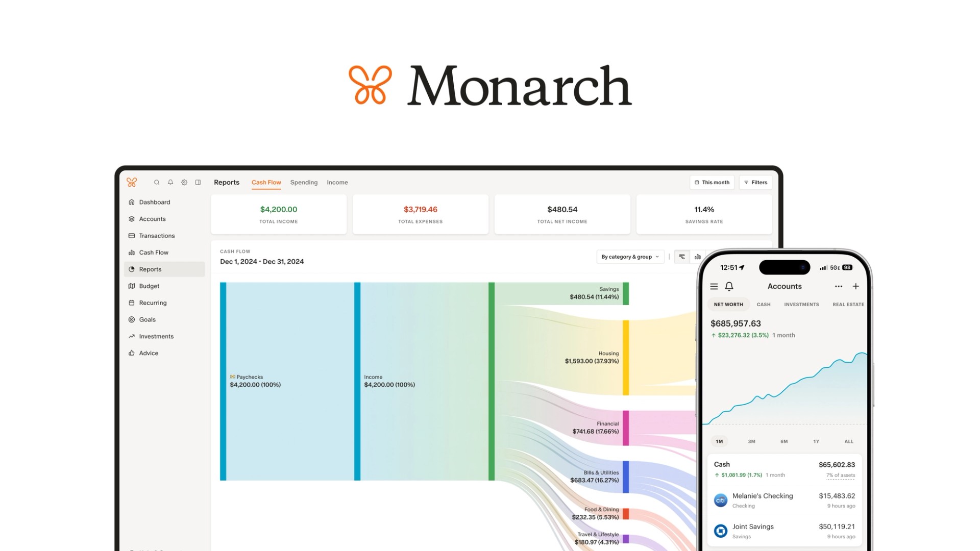
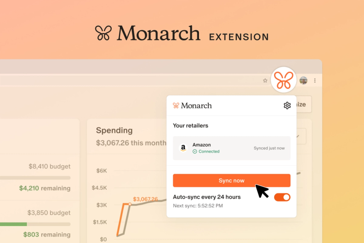
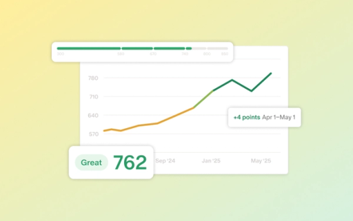
Monarch has come a long way since we launched four years ago. Monarch’s feature set has expanded significantly across web, iOS, and Android as we work toward our mission of helping people lead richer lives by making better financial outcomes available to all.
While so much has evolved, some parts of Monarch have stayed the same — and we decided it was time for a refresh.
Over the past few months, a small team has been hard at work tackling a number of “quality-of-life” improvements that will make Monarch even more enjoyable to use. We’ve improved information density, boosted color contrast, and improved some of our core features to make Monarch better than ever.
Improvements to Reports and Recurring
Interactive reports
You can now interact directly with all reports and charts on the desktop version of Monarch to dynamically filter your transaction list right on the same page. This has been one of our most-requested features, and it makes it easier than ever to update your transactions. You’ll see your reports update live, without having to jump to another page.
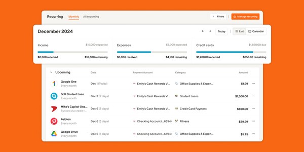
Better visibility for your recurring expenses
Recurring costs are the foundation of your budget — things like your mortgage, car payments, and other essentials that need to be covered first. We’ve revamped the Recurring page and added a handy summary view, making it easier for you and your partner to see what’s ahead and plan your cash flow more effectively.
Clearer Colors and Contrast
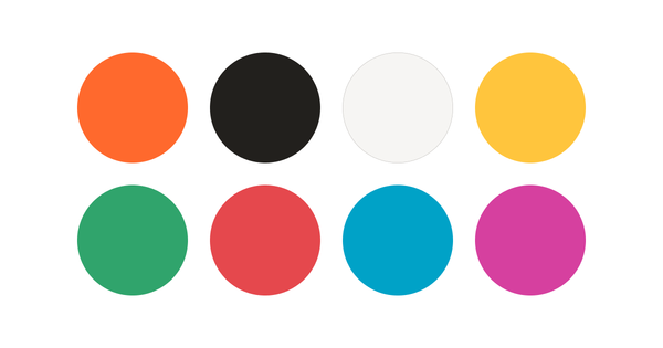
An updated color palette
With our updated colors, Monarch keeps its vibrant look while adding a sense of warmth and approachability. We’ve also listened to your feedback: the expanded palette improves contrast, making it easier to scan your budget, read reports, and update transactions.
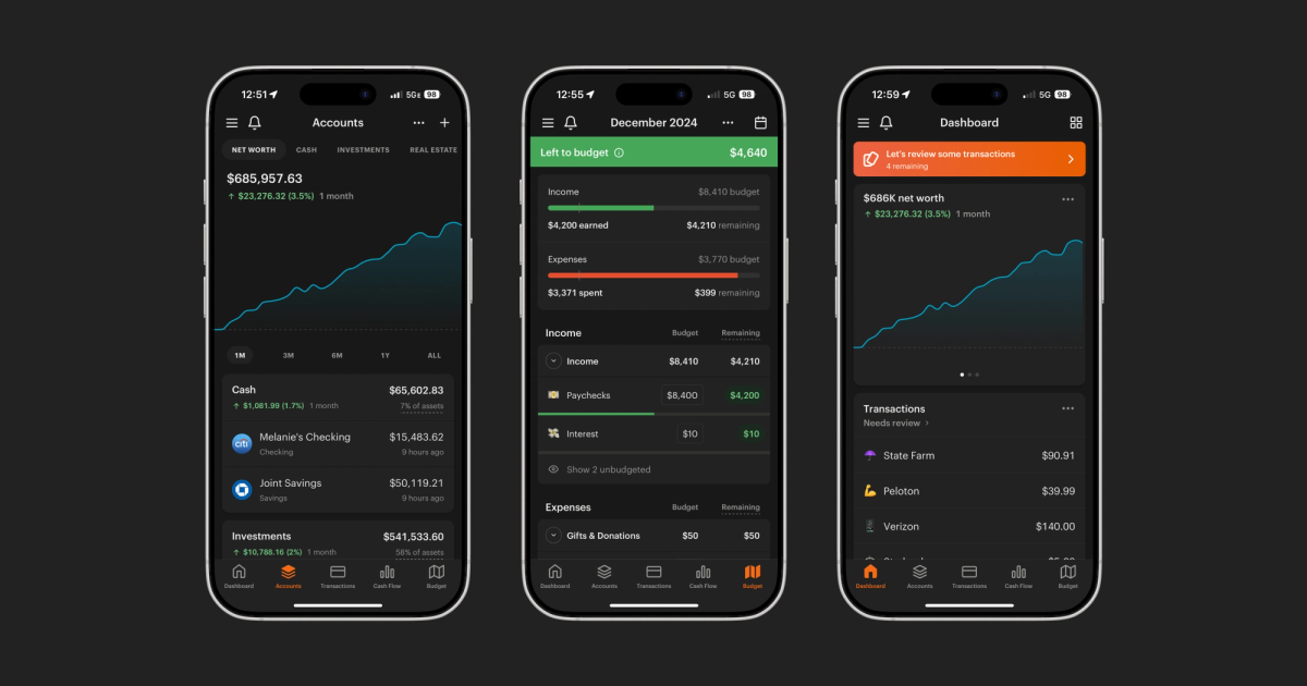
Improved dark mode
The updated color palette brings a completely refreshed dark mode, making your Monarch experience feel more in tune with the rest of your digital world. And yes, we’ve retired what some of you lovingly referred to as “Navy Mode” 😄
More Room to Operate
More information, less scrolling
We’ve listened to your feedback and tweaked the whitespace in key areas to pack in more information where it matters most. You’ll notice these updates on the following pages:
- Dashboard. We’ve redesigned the dashboard widgets to better utilize space on both desktop and mobile.
- Accounts. We’ve improved information density for the accounts page on desktop, and made each group of accounts collapsible.
- Transactions. We’ve condensed the height of each transaction row on desktop and mobile to bring more into view.
- Budget. On desktop, you can now collapse the income, expense, and contribution sections completely. We also tightened up spacing to bring more of your budget into view.
Updated navigation & breadcrumbs
We’ve given the navigation a refresh in the browser version of Monarch. The sidebar is now functional even when collapsed, giving you more room to dive into your finances. Plus, we’ve added breadcrumbs to detail pages to make getting around even easier.
Our New Logo: Two Wings, One Line

A new logo
We chose the name “Monarch” because the butterfly is an extreme symbol of transformation, and we’ve seen firsthand how better financial practices can transform people’s lives. The butterfly isn’t going anywhere — but like our product, it’s getting a refresh to better represent how we serve you.
- We’ve redesigned our logo to capture the simplicity and ease that comes with bringing all your finances together in one place.
- Our updated logo incorporates this collaborative spirit of managing your finances with a partner, advisor, or coach — it’s now made of two distinct lines that come together, joined in a common purpose.
(We also added a small easter egg: You can now customize the mobile app icon, on iOS specifically)
What's Next
In parallel with everything launched today, we’re continuing to make progress on a number of projects we know are important to you.
Data Connectivity
First thing next year, you can expect a simplified process for transferring data when switching your account connection to a different provider. This will make it easier to merge the transaction and account balance history from your old account with the new one. While we acknowledge this doesn't solve connectivity issues, it will make for a more seamless process for switching providers when those issues arise.
Beyond this, we now have a team fully dedicated to improving connectivity. Our multi-pronged approach includes getting to quicker diagnosis of issues, improved guidance when a disconnection occurs, and enhanced transparency into whether a connection issue is specific to your account, your institution, or on Monarch’s side. We also continue to collaborate with our data partners to improve “troublesome” connections with certain financial institutions.
Goals
We’re revamping our Goals feature to make it even more simple and intuitive for you to plan for your savings goals, big and small. You can also expect to see this launch early next year.
Saved views on Reports
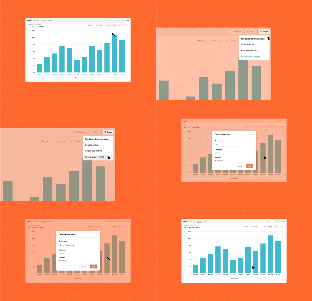
Another highly requested item is the ability to save particular views in Reports so you can get the personalized insights you need more quickly, any time you visit the Reports page. This is in the works and will be available soon.
---
Get a heads up the moment they are ready by joining our Reddit community or by keeping an eye on our What’s New updates. Thank you again for joining us on this journey. We’re looking forward to all that’s to come in 2025!
Changelog
Here is a full list of the improvements included in this update:
Mobile
- Updated dark mode and light mode color palettes to improve contrast
- Redesigned mobile dashboard cards to improve information density
- Added an income, credit card, and expenses summary to the recurring tab
- Reduced the height of transactions in lists to improve information density
- Reduced the height and gap of the bars on the Cash Flow screen to improve information density
- Reduced the height of settings lists and menus to improve information density
- Redesigned left navigation to more clearly differentiate features and settings
- Added a confirmation step when tapping “Mark all as reviewed” to prevent accidental bulk updates
- Moved the notification bell out of the left menu and into the header to reduce friction
- Added the ability to customize the mobile app icon from settings
Desktop
- Updated dark mode and light mode color palettes to improve contrast
- Reports charts are now interactive and filter the transactions list below when clicked
- Added an income, credit card, and expenses summary to the recurring page
- Added breadcrumbs to detail pages to make navigation easier
- Made the main sections of the budget page collapsible and improved information density
- Redesigned the left navigation so it can still be used when collapsed
- Reduced height of transactions in lists to improve information density
- Added a toggle on the Accounts summary to switch between Total Amounts and Percents
- Made account groups collapsible on the Accounts page
- Simplified the header of account groups to improve information density
- Shrunk the height of the account rows on the accounts page to improve information density
- Simplified chart axis styling to improve visual polish
- Reduced top margin of all modals to reduce the need to scroll
- Shrunk the width of the left navigation and global padding to improve information density

