Net Worth Improvements
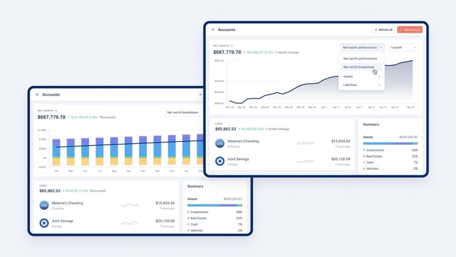
We’ve added a ton of chart options to the web interface so you can view all areas of your net worth. In addition to our existing net worth breakdown chart, you can now visualize your net worth with a line chart, and zoom in on your assets and liabilities as well. This brings a lot of the features we added to mobile recently to web.
Transactions Improvements
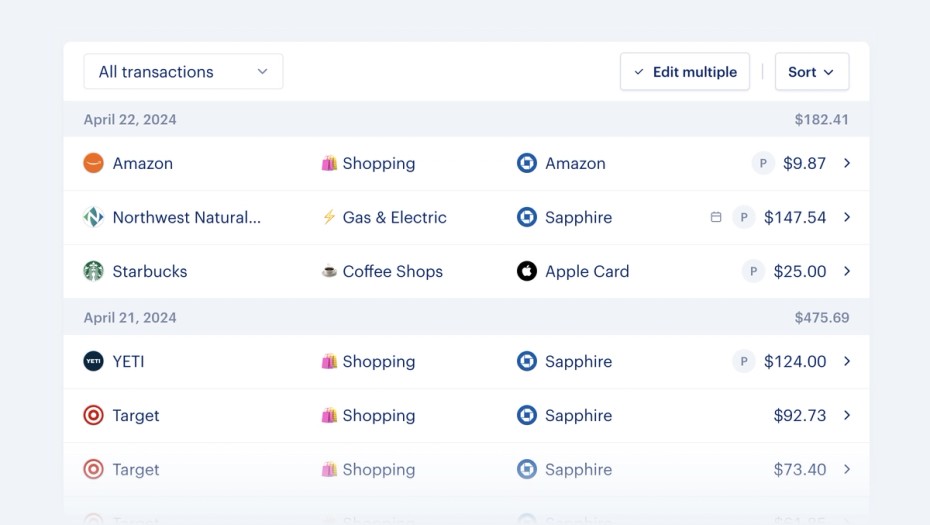
We’re starting to roll out improvements to the transactions page on web that adds the account information to the table, as well as consolidates all filters into a new menu (with a few brand new filters as well). There are also new arrow buttons next to merchants and categories that lets you quickly jump into your historical spending for both. This is a first pass at improving the data density of the transaction grid, and we’re exploring making it more customizable to fit your specific needs.

Other Improvements
- Added a badge to Pending transactions in the mobile app so it’s easier to distinguish between pending and posted transactions
- Categories can now be excluded from the budget. This is a new setting on the category that you can update from the Category Settings page or from the Budget page.
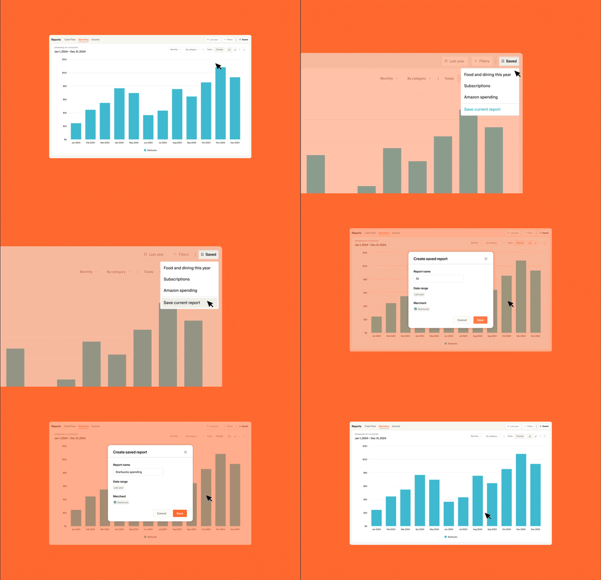
- Added more filter options to Reports page. Now you can filter by transaction amount, reviewed status, recurring status, and if the transaction has attachments, splits, or notes. The options here now match the Transactions page.
Connectivity
We’re continuing to work closely with our data provider partners to improve our data freshness, and our ability to communicate status and temporary issues within the product. In addition, we are exploring adding in new data providers to provide the best coverage possible.
CS Response Times
We’re now fully staffed 7 days a week and are able to reply to most tickets within 24 hours. In addition to closely monitoring response time, we have also revamped our CSAT survey and will be reviewing the feedback ongoing to continue improving the quality of our support experience.
Bug Fixes
- Fixed an issue where tapping the force refresh option on an account would sometimes immediately show a success message instead of the loading message. It can take up to a few minutes for this action to complete, so it was misleading to show the success message right away.
- Fixed an issue where clicking on a notification about transactions that need to be reviewed sent users to the unfiltered transactions page in the mobile app. Now it will open to the filtered list of transactions that need review.
What’s Next
Bill Tracking - We know this is a highly requested feature and have been taking substantial steps toward delivering this experience for Monarch users:
- User Interviews:We conducted 6 user interviews to get feedback on some initial prototypes, and understand some of the core problems our users are wanting to solve with this feature.
- Testing Data Quality:Up next, we will be releasing a new ‘Liabilities Table’ to the Settings page, where a percentage of users will have the ability to see information like statement balances, due dates, minimum amounts due, etc for their credit cards and other connected debt accounts. In the background, we will be attempting to understand the consistency and presence of each attribute, while relying on users to provide feedback on the accuracy of each field.


